Friday, October 27, 2017

ArcCollector Part 1


Introduction
The purpose of this lab was to learn to utilize the ArcCollector app as a means for collecting data in the field and upload them in real time to a single destination where all the rest of the data collected by the class would be brought into a map.  Smartphones are becoming more common as a tool for data collection because they have more computing power than typical GPS units, and they have the ability to access online data.  The data points collected by the class had several attributes and each point was uploaded on the fly.

Study Area
The study area for this activity was mostly on the UW - Eau Claire campus, with a couple sections near Water Street.  The numbers in each section show the designated zones assigned for each student to collect data points, as shown in Figure 1.

Figure 1: The study area on UW - Eau Claire's campus and across the footbridge.  


Methods
First each student had to install the ArcCollector app, as seen in Figure 2.  The app allows you to choose a basemap, use the GPS on a smartphone to find location, and collect data points with multiple attributes that can be uploaded on the fly.

Figure 2: The ArcCollector app as seen on a smartphone.

Each student was then assigned a zone to collect data points within.  Each data point collected had the following fields to be input:
-Temperature (°F) 
-Dew Point
-Wind Chill
-Wind Speed
-Wind Direction
-Time

A Kestrel 3000 Pocket Weather Station (Figure 3) was used to find the weather information, a Suunto compass (Figure 4) was used to determine wind direction, and the phone was used for the time.

Figure 3: The pocket weather station used to collect weather condition data.  
Figure 4: The Suunto compass used to determine wind direction.  
The GPS on the phone and the map on ArcCollector were used to determine location and they helped to ensure data points were spread evenly across the assigned zone.  Over the course of an hour and a half, several data points were collected per zone and uploaded to a single destination where they could then be brought into ArcMap together to be mapped offline.  The resulting maps are displayed in the Results/Discussion section.


Results/Discussion
Figure 5: This map shows the temperatures from the recorded data points. 
By analyzing the temperature map in Figure 5 it can be observed that temperatures on both upper and the main lower campus vary considerably, in a range of about 15 degrees.  One possible reason this could occur could be due to some spots being in the shade and some spots being in the sun.  Another could be differences in the ways in which the students were collecting temperature.  If the pocket weather station was kept in the student's actual pocket before collecting data from that point, the data would be compromised because the temperature would be recorded higher than it actually was at that point and time.  Across the foot bridge the temperatures had a bit less variation, with temps ranging between 49 degrees and 58 degrees.  There does seem to be some observable clustering of temperatures in this area, with similar temps recorded being near other similar temps.

Figure 6: This map shows the dew points from the recorded data points. 
The dew point recordings on the map in Figure 6 seemingly show more patterns than the temperature map.  Dew point measures what temperature the air would have to be to become saturated, so it a measure of temperature and absolute humidity.  Upper campus shows the warmest dew points in general, while the recordings on lower campus and across the river show the colder dew points.  This could be because it is closer to the Chippewa River, the elevation is lower, or there were colder temperature recordings.
Figure 7: This map shows the recorded wind speeds and directions from the recorded data points. 
The map in Figure 7 displays the wind speed and wind direction.  It can be observed that wind directions on upper campus near the Southwestern end seem to mostly come from the Northeast.  Other than that they are varied.  On main lower campus they are widely varied in direction.  It could be speculated that the variance in wind direction recorded on both upper and lower campus are probably due to the fact that there are many large buildings scattered throughout campus, as well as forest.  These features tend to have a large impact on wind speed and direction.  It can also be observed that on the foot bridge and across the river the wind speed is generally much higher and follows a direction pattern.  The recordings along the river all seem to have wind coming from the East/Northeast.  This could likely be explained by the fact that wind can travel more easily over water than land with features like trees and buildings, because there is nothing obstructing it.
Figure 8: This map shows the recorded wind chills from the recorded data points.  
The map in Figure 8 shows wind chill, which is a recording of temperature with wind speed taken as a factor.  It can be observed that in areas on both upper and lower campus that are not near the river, the wild chill tends to be higher.  This is because both the temperatures recorded in these areas are higher and the wind speeds are lower.  Along the river almost all the wind chill recordings were between 36 and 52 degrees.  The variance in wind chill could be very dependent on wind speed variance.  Wind blows in gusts, so at any given time the recording could vary by several miles per hour, which would in turn have a big effect on the wind chill recordings.


Conclusions
This activity demonstrated that effective maps can be created using data collected with the ArcCollector app on a smartphone, a weather conditions collector device, and a compass.  The data was collected simply and quickly.  More precise collecting methods could be used to get a more reliable data outcome, but this activity demonstrated the effectiveness of the app and of a smartphone as a practical data collection device. 


Monday, October 23, 2017

Survey123 for ArcGIS Tutorial

Introduction/Background
The purpose of this activity was to go through the Survey 123 for ArcGIS tutorial to learn how to create a survey, map and analyze the collected data, and share the survey data by creating an app for users' smartphones or tablets.

There were 4 "lessons" within the tutorial:
1. Create a survey
2. Complete and submit the survey
3. Analyze survey data
4. Share the survey data

The survey app was explored thoroughly throughout the tutorial.  Screenshots were taken throughout the tutorial on both the desktop and the smartphone to document the entire process.  This is the link to the tutorial on the ArcGIS website: https://learn.arcgis.com/en/gallery/


Steps
1: Creation of a survey
A survey was created to help the homeowner association (HOA) assess their community members' disaster preparedness for earthquakes and home fires.  Figure 1 shows the first step in creating the survey: adding the name, tags, and summary.

Figure 1: Creation of the survey. 
Next, questions about the participant and their residence were entered into the survey using the design tab.  This is shown in Figures 2-4 show these steps.

Figure 2: The survey completion date was the first question added.  

Figure 3: Rules were set for some questions when specification was necessary.  

Figure 4: This screenshot shows the final questions entered.  There were 29 questions total.  
The survey was then published.  This enabled me to preview the survey to double-check that everything was entered correctly and navigate it how a smartphone or a tablet would view it (Figure 5).

Figure 5: This shows the preview of the survey in smartphone mode.  


2: Complete and submit the survey
Now that the survey was published the settings can be altered to decide who to share it with.  The survey was then opened in a web browser to test it out.  Figure 6 shows the completion of the survey as a test.

Figure 6: This notification showed that the survey was completed as a test.  
The Survey123 for ArcGIS app was then installed onto my smartphone, as shown in Figure 7.
Figure 7: This screenshot from my Android smartphone shows the Survey123 for ArcGIS app in the Google Store.  
Once the app was opened and I signed in using the UWEC enterprise account, the survey was downloaded to the phone in "My Surveys", as seen in Figures 8 and 9.

Figure 8: The surveys available for download are shown here.  
Figure 9: The survey is downloaded into My Surveys.
The survey was then completed to test it out using the app on a smartphone this time.  The survey was then completed several more times to collect enough data to be analyzed.  Figure 10 shows each survey that was completed.  The information in each survey was fake but varied just for the purpose of testing out the app and having enough data to be analyzed.
Figure 10: Each survey completed on this smartphone is listed here.  

3: Analyze survey data
The Survey123 website was then visited and its reporting capabilities were explored.  It gave detailed reports that could be analyzed in several ways.  The data collected from each survey is compiled here, and the interactive reports were also explored.  Figure 11 shows one of the tabs that shows statistics from the data collected in the survey and Figure 12 shows a map with the data.

Figure 11: This screenshot shows the overview statistics from the survey data.  
Figure 12: This screenshot shows the map from the Survey123 for ArcGIS website that displays various results from the survey.  

4: Share your survey data
The final step in the tutorial was to create a customized map with only specific fields included, as seen in Figure 13. Once the map was saved, a web app was created using the share button on the interactive map.  The interactive map was then finished and available for users.

Figure 13: This shows the final web app created throughout the tutorial. 

The map shows three different locations in which I determined where my residence was located.  Because almost all of the information used when taking the survey several times was false/fake, the patterns are random as far as the results in each field.  However this map is especially helpful because it is interactive.  Users can navigate through the map, between location points, and they can observe the results from each individual survey if they want to. 

Conclusion 
Survey123 for ArcGIS could be quite useful in future research, projects, or field work.  It has a relatively simple interface which allows for easy creation of surveys that can be mapped.  It is also nice that it has an app that can be used on smartphones and tablets.  Users can complete the survey and include their location, and the resulting data can be analyzed using the website. 

ArcGIS website citation:
“Lesson Gallery.” Lesson Gallery | Learn ArcGIS, learn.arcgis.com/en/gallery/.

Activities Using Bad Elf GPS

Introduction
The purpose of this activity was to become more familiar with the Bad Elf GPS unit by pairing it with a cell phone application and mapping an area on the UW - Eau Claire campus.  The class was split into groups and set off to walk paths/patterns of choice.  Line features were tracked using the Bad Elf, the paths were stored in the iphone app, and maps were to be created from the results.

This activity also had the purpose of exposing students to some other possible cell phone applications that are useful in collecting data and storing them within a cell phone.  These apps include: Collector, Survey 123, GIS4 Mobile, Theodolite, GAIA GPS, and Galileo Offline Maps.  Some of these were to be used later in the class and some others could be useful tools in other projects or recreational activities.  The use of survey GPS units that can pair with cell phones through Bluetooth is becoming increasingly popular because it is cheaper to use cell phone apps than to create a large screen on the same GPS device with the same level of functionality. 

Study Area
The study area was UW - Eau Claire's lower campus, as shown in Figure 1.

Figure 1: The map of UW - Eau Claire's lower campus within the city of Eau Claire.


Methods
The first step was to download the Bad Elf App to the iphone.  Next the Bad Elf was used to record a tracklog of the path walked, which could later be exported as a KML or a GPX file by pairing with the cell phone.  Then a logfile was started, and line features were recorded by walking around various sections of lower campus.  Once those were completed the tracklog was uploaded to the phone. Within the phone app then it was shared as a KML in an email to each group member.   This KML was used to create a map in ArcGIS Earth that shows the tracklog from the activity, as seen in the results.


Results
Figure 2: The tracklog is shown in this map in ArcGIS Earth.  
The map in Figure 2 shows the tracklog taken with the Bad Elf GPS.  It is zoomed out quite far because zooming in closer showed imagery that was not up to date where the path would be crossing through old buildings on campus.  Though this result doesn't quite show high accuracy or direction, it is a good example of a quick tracklog that can be taken and uploaded to ArcGIS Earth. 


Conclusion
This activity gave a chance to work with a basic GPS device that can be paired with a cell phone through Bluetooth to connect to an application where the tracklog can be exported to any destination.  It was a simple method for acquiring a fairly accurate path. 


Creation of Navigation Maps

Introducion/Background
This purpose of this activity was to create two navigation maps.  They will later be used for actual navigation in a field activity.  Map elements that would be helpful with navigation were to be included in the final maps.

Study Area
The area in which we will map and navigate is the Priory, just South of Eau Claire. Figure 1 shows the study area.

Figure 1: The study area map with the Navigation Boundary in red.


Methods
Map data was provided by Professor Hupy, but all layers were in different projections.  The projections were then each defined in ArcCatalog to be Transverse_Mercator with  NAD_1983_UTM_Zone_15N as the coordinate system, since Eau Claire falls within UTM Zone 15.  This is shown in Figure 2.

Figure 2: Each feature is assigned the same coordinate system so they are in the correct place when brought into the map.  
Each student was then able to choose which layers to include in their navigation maps.  I decided to use the imagery basemap from ArcGIS as the background for my map so that specific features could be easily identified, as shown in Figure 3.

Figure 3: This is the defined area's boundary and the imagery basemap.  
The next step was to include a grid in the map.  Grids can be created in the Layers Properties.  Figure 4 shows some of the properties of the grid created for this map.  Each interval is set at 50 meters, which is a reasonable distance for navigation on foot.

Figure 4: This shows some properties of the grid created for this map.  
A new map was then made with the same data and projection but a different grid.  This grid was made in decimal degrees.  Figure 5 shows some properties of this new grid.  The intervals are set at 5".

Figure 5: This grid is for the decimal degrees navigation map.  

Results 
Figure 6: The final UTM navigation map.  
Figure 6 shows the final UTM navigation map.  This could be used for locating landmarks shown in the imagery basemap.  It has a tighter grid than the decimal degrees map, so it could be useful for finding a more exact location.  

Figure 7: The final decimal degrees navigation map.  
Figure 7 shows the final decimal degrees navigation map.  It has slightly larger grid areas that are rectangular, and could be useful as a map for a general area that is not quite as specific as the other map.  It slits the area into larger areas, but can also utilize the imagery in the map to locate land features. 

Conclusion
There are several ways a navigation map can be created and displayed.  The final product should be functional and should pertain to the intended use of the navigation activity.  The final map results from this activity demonstrate only a couple variations of elements that could be included in this type of map.  Other things like contour lines, hillshade, etc. could help show the terrain and slope of the landscape better, or other types of basemaps could show characteristics of the land that may not be captured in the imagery basemap. 


Tuesday, October 10, 2017

Litchfield Mine Field Surveying Activities

Introduction
On Saturday, September 30th the class visited the Litchfield Mine to make an evaluation of UAS platforms and GPS units for ground control.  Some of the main goals of this trip were to: personally lay ground control points (GCP's), observe the difference in consumer grade and survey grade GPS devices, and weigh the pros and cons between different types of unmanned aerial system (UAS) platforms.  The data collected will be later processed and analyzed, so detailed note taking throughout the day was important.

The Litchfield Mine is an aggregate mine that contains large piles of different rock, sand, and other material.  This mine is regularly surveyed to determine how much material has been deposited or taken from the piles.  Unmanned aerial systems (drones) can be used as a method of surveying the mine to measure the sizes of each pile of material.  This is done by laying ground control points and noting the exact location of each using GPS.  The imagery taken throughout the flight path of the drone is then brought into a GIS and the imagery is laid down onto a map by pinpointing the exact location of each of those GCP's.  This is also known as georeferencing.  This is a relatively new form of technology so the entire surveying industry does not rely on UAS, but this emerging surveying method shows promising efficiency.

UAS professionals from the surveying industry were invited by Professor Joseph Hupy to give demonstrations using their survey grade UAS platforms and other surveying technology.  Professionals from Topcon Solutions and Menet Aero came to work with us in the field.  They provided some cutting edge drones as well as a wealth of knowledge about the industry and new technology.

The study area is shown in Figure 1.
Figure 1: This map shows the location of the Litchfield Mine, near Eau Claire, Wisconsin.  


Methods
The first step we took in surveying the mine was laying down ground control points.  The class laid 16 GCP's throughout the mine.  Each GCP is about a 2' x 2' colored square marker with a center point from which to measure the exact GPS location.  The more GCP's used in a survey the more accurate the survey can be when it is georeferenced later.  They must also be spread wisely throughout the mine.  If some GCP's are too bunched together it can create warping of the imagery when being georeferenced.  The location of all the GCP's were noted in a rough drawing in a field notebook so that none of them were lost in the process.

Once all the GCP's were set we measured the GPS location using three different devices: the Topcon HiPer, the Bad Elf GPS, and an iphone.  This is shown in Figure 2.  The Bad Elf and iphone locations were recorded by the students, and the Topcon HiPer units were recorded by the professionals. The professionals from Menet Aero also laid down Arrow GPS markers to make some extra GCP's, as seen in Figure 3.  Each marker is solar powered and waterproof, and they record their GPS location with the press of a button.

Figure 2: This picture shows GCP #8.  Peter from Menet Aero records the location with the Trimble R2, while my group members record the locations from the Bad Elf and the iphone.  
The Trimble R2 runs off an iphone or ipad, using the Trimble app called terraflex.  The surveying tripod must be directly on the center of the GCP because it is much more accurate than the Bad Elf or the iphone.  The Bad Elf and iphone were not accurate enough for it to matter whether either of them were directly on the center of the GCP.  The actual GPS signal for the Trimble R2 is sent from the top of the tripod stand so that the body of the person using the device does not interfere with the signal.


Figure 3: The Arrow GPS Marker is shown here; it is an electronic GCP.  The Trimble R2 was used to get the same location of the Arrow Marker so the precision of the measuring devices could be compared later during the analyzing process.  
The Arrow Markers are convenient because they almost automatically upload their GPS location with the press of a button, and they communicate with a satellite and with each of the other Arrow Markers being used.  One downside to these is that they are each around $500, and you are limited by the number of these that you have, so using these can be much more expensive than just using painted plastic squares for GCP's.  They also claim to be accurate to 2cm, but Peter Menet said he found them to actually only be accurate to about 6cm.  The Trimble R2 was used to measure the Arrow Marker's GPS as well so that the accuracy could be tested when the data collected from the day will be analyzed at a later time.

The Topcon HiPer was also used to record the location of each of the 16 GCP's.  This device is very similar to the Trimble R2, as seen in Figure 4.  The Topcon HiPer runs off a screen device that records the longitude, latitude, and elevation.  The data collected from the day will be used to compare the accuracy of the locations from each device so they too can be compared to each other when the data is analyzed.

Figure 4: This picture shows the Trimble R2 (yellow) alongside the Topcon HiPer (red).  


Next the UAS platforms were flown to survey the mine, and Josh Nave from Topcon also showed us a stationary device used to survey individual piles (Topcon Robotic Total Station).  The professionals from Topcon Solutions and Menet Aero informed us of the pros and cons of each device, as well as cost and other important details.

Figure 5: PJ from Menet Aero flies the Phantom 3.  
Figure 6: This image shows the handheld controller with a screen that is used to control the Phantom 3.  
 Figures 5 and 6 show PJ from Menet Aero flying the Phantom 3.  It is a multi-rotor drone.  It first flies to 250 feet to calibrate before flying the assigned mission.

Figure 7: Here Josh from Topcon Solutions prepares the Ebee Plus for flight.  
Next Josh from TopCon Solutions flew the Ebee Plus.  This is a fixed wing aircraft with a mostly Styrofoam and plastic body.  It has a 20 megapixel camera, it is hand-launched and can be controlled from any PC.  Once launched, it hovers around "home" until you verbally command it to "go to mission".  This drone actually malfunctioned shortly, then after Josh commanded it to "come back to home" it encountered complete failure.  It flew off track and spiraled downward, crashing into the Chippewa River a couple hundred yards away.  Because it floated, it was able to be rescued down-river within an hour.  This was the first time Josh said he encountered this type of malfunction with the Ebee Plus.

Figure 8: Peter Menet flies the M600 Pro with Zenmuse X5.  This one is more expensive and powerful so the launching/landing area must be coned off.  
Figure 8 shows Peter Menet launching the M600 Pro with Zenmuse X5.  This is a multi-rotor drone with an external camera and has five battery packs.  The more battery packs it can hold, the longer the flight time ability.  This drone records RTK, which stands for Real Time Kinetics.

Figure 9: Peter Menet prepares the C-Astral Bramor w/ Sony a6000 for flight.  
The C-Astral Bramor w/ Sony a6000 is a fixed wing drone that has a launching stand.  The preparation for the flight was exhaustive in order to make sure it was launched correctly.  It is cranked tight with the large red rubber chords then launched into the air.  This drone also ended up crashing, which is very unusual to have two drones fail in the same day.  The parachute ended up not deploying and it crashed into a tree, completely destroying the body of the aircraft.

Figure 10: Josh Nave from Topcon Solutions shows how the Topcon Robotic Total Station is used to measure/model a gravel pile.  
Josh from Topcon also gave a demonstration of the Topcon Robotic Total Station, which can be used to survey an object or area with very high accuracy.  The station scans objects with a laser every three seconds.  It can do volumetrics, but the time it would take to scan the pile in the background was roughly an hour.  So it is very accurate, but very time consuming. 


Results
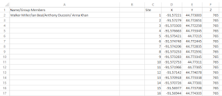
Figure : This is the excel spreadsheet that includes the data collected from the iphone for our group, with the z coordinate being the elevation unit.  

Conclusion
This fieldwork proved to be a valuable experience in learning about UAS platforms and surveying with this cutting edge technology.  The professionals from Topcon Solutions and Menet Aero were good resources in providing us with background information about each of their devices, as well as informing us about the surveying industry.  This technology may begin to become the main way in which volumetrics is modeled and measured in the surveying industry.

The fixed wing drones may be more expensive and seem more reliable than the rotary wing drones, but after observing the two fixed wing drones crash it seems that the rotary wing drones may be more reliable in similar conditions to what we had on Saturday.  It should also be noted that insurance for these drones is very important.  The total number of dollars in equipment used throughout the day was up to a couple hundred thousand dollars, so having insurance on this equipment is vital just in case accidents do happen.

We were able to conclude that the GPS in smart phones is much less accurate than the Bad Elf, and the data that will be processed later will probably reveal that it is far less accurate than the survey grade GPS devices.