Tuesday, December 12, 2017

UAS Data Processing with GCPs

Introduction
The purpose of this activity was to illustrate the importance of ground control points (GCPs) in processing UAS imagery and creating accurate digital models of the Earth's surface.  The data used for this project was the same as the previous activity, only GCPs were used in the data processing to create a result that is accurate and represents the true elevation of the area surveyed.

GCPs are points on the ground used to "tie down" an image to the representation of Earth's surface, either based on a geoid or an ellipsoid.  They are used to georeference images so that the locations on the images can be accurately located on the digital representative surface.  Sixteen GCPs were used when surveying the Litchfield mine.  They were spread out throughout the area of the mine so that when the resulting data would be processed distortion could be minimized.  Because the processing done in the last activity was done using no GCPs, the elevation was based on a ellipsoid, which is the default for DJI and other surveying platforms.  The GCPs allow the elevation data to be processed using a geoid, based on sea level, which is the desired result.

The study area is the same as the previous lab, the Litchfield Mine near Eau Claire, Wisconsin.


Methods
Basically the same process was used in this lab as the previous one, the only difference being the use of GCPs in the data processing.

The first step was to save the project after initial processing from the previous lab with a new name in a new folder.  Then the GCP manager was opened in the project tab, as shown in Figure 1.
 
Figure 1: The GCP manager is shown where the GCPs were to be imported.
Next the GCPs were imported.  Then using the basic editor, images were clicked for each GCP to assign them with a cross, giving each GCP one or two crosses, as shown in Figure 2.

Figure 2: The GCPs are clicked to their location by zooming into the cross of each GCP in the images. 
It was then reoptimized.  The Raycloud Editor was then used to improve the accuracy of each GCP, as shown in Figure 3.

Figure 3: The lower right corner shows the images with the GCPs where the crosses showing their exact location on the image can be adjusted to exactly where they should be, at the cross hairs of the square GCP.  

It was then reoptimized again.  Then the processing was run for 2. Point Cloud and Mesh and 3. DSM and Orthomosaic. Figures 4 and 5 show the quality reports for these processes.

Figure 4: The quality report from part 2. in processing.  

Figure 5: The quality report from part 3. in processing.  
The arcviewer was a viewing option to show where each GCP was located on the surface model.  Figure 6 shows this.

Figure 6: Arcviewer displays the surface model in 3D with the location of each GCP throughout the mine.  

Now that the processing was completed, the DSM and mosaic images were brought into ArcMap to create maps of the outputs.

Results

Figure 7: This map shows the DSM created using GCPs from the UAS imagery.  When comparing this to the image/map created with the same process but no GCP's, the main difference is the difference in elevation values.  This map shows the correct elevation between approximately 225 meters and 250 meters.  The previous map had a low of about 80 meters and a high of about 105 meters.  Because this map used GCPs it was able to use the correct elevation.  This is easily notable because the Eau Claire area lies in general between 700ft and 800ft, not around 300ft like the previous map showed.  The use of GCPs also allowed for a more accurate depiction of elevation change within the mine.  When calculating the difference of the map highs and lows for each map, the difference in elevation on map with GCPs is 23.708 meters, and the difference in elevation on map without GCP's is 24.1971.  When surveying/modeling an area and using volumetrics even one foot can mean a difference in quite a lot of material, so using GCPs ensures much more precision and is the more trusted method.  

Figure 8: This map shows the orthomosaic using the GCPs from the UAS imagery of the mine.  When comparing this to the map using the same process but without the GCPs, it is hard to notice much of a difference.  Though there are very slight differences observed when looking at this scale, it ends up looking very similar.  The knowledge that this image/map used GCPs and acquired the correct elevation makes this the desired result of the processing.  

Conclusion
The results of the processing with GCPs doesn't look too much different than the results from the previous lab, however when looking at the legend of each map one can observe the difference by over one hundred meters is very important.  Using GCPs helps to acquire not only the correct height above sea level for the entire orthomosaic image, but it also helps to create a more accurate model that shows the terrain and change in elevation throughout the mine. 


Monday, December 11, 2017

UAS Data Processing With No GCPs

Introduction/Background Information
On September 9th, 2017 imagery was gathered using the DJI Phantom 4, a drone platform with 13.3MP RGB sensor with a rolling shutter.  The purpose of this activity was to process this data using PIX4D and create usable maps including the elevation data. PIX4D is the current and premier advanced photogrammetry software that uses images to create professional orthomosaics, point clouds, 3D models and more.

Link to the Software Manual:

The following questions were addressed to learn more about the software manual for PIX4D:

o Look at Step 1 (before starting a project). What is the overlap needed for Pix4D to process imagery?
     -The overlap depends on factors like the speed of the UAV/Plane, the GSD, and the pixel resolution of the camera.  The example in the manual uses 75% overlap.

o What if the user is flying over sand/snow, or uniform fields?
     -Areas that are sandy or snowy that are more uniform in look will need more overlap.  The manual recommends at least 85% frontal overlap and at least 70% side overlap.

o What is Rapid Check?
     -Rapic Check is an alternative process that is faster but produces lower resolution results in order to check if coverage was obtained.

o Can Pix4D process multiple flights? What does the pilot need to maintain if so?
     -Yes, multiple flights can be merged together, but each has to have the same horizontal and vertical coordinate systems.  Having enough overlap and similar weather conditions are also important when processing multiple flights.

o Can Pix4D process oblique images? What type of data do you need if so?
     -Yes, but the data needs to be tied down with GCPs, and it works better when the terrain is not flat.

o Are GCPs necessary for Pix4D? When are they highly recommended?
     -They are not necessary, but they are highly recommended to improve the georeference and accuracy of the reconstruction.

o What is the quality report?
     -The quality report documents the details of the results from the processing.

*This activity was used as an example of mapping data that contains errors.  Because GCPs were not used to tie down these images during the processing, the elevation is wrong.

Study Area
The study area is the Litchfield Mine, near Eau Claire, Wisconsin, as shown in Figure 1.  This is the same site as the activity earlier in the blog.

Figure 1: The study area is the Litchfield Mine outside of Eau Claire, Wisconsin.  

Methods
First a new project was created in PIX4D.  The project was named based on the date, site, platform type, and altitude.

Then the images were added to the project.  It was important to examine the camera properties and fix any incorrect information, because some of the settings were not correct.  Figure 2 shows the processing options that can be altered even after they are originally set, but before the processing has begun.

Figure 2: This image shows the Processing Options window where settings can be altered.  

The rest of the defaults were left as they were, and the initial processing was started.  Figure 3 shows the processes available.

Figure 3: The processes available to be run.  They can be checked and then started either one by one, or all at once.  
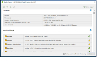
First the Initial Processing was completed, to ensure that coverage of the area was correct.  Then 2. Point Cloud and Mesh and 3. DSM, Orthomosaic and Index were run.  A quality report is produced to show the details of the process, as shown in Figures 4 and 5.  Overall, the processing took about 2.5 hours to run.

Figure 4: The quality report that was produced from the processing.  

Figure 5: These are some of the details shown and explained in the quality report.  
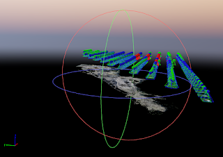
The results could then be viewed in several ways.  Some of the cameras were shown as red, meaning they were not processed correctly due to any number of reasons.  But because they are located in forested areas, which are of no interest to the project they can be clipped out.  A polygon can be drawn around the area of interest so that the rest of the area that was captured in the flight that is not necessary does not get included in the project.  Figure 6 shows the newly created surface being viewed in the Ray Cloud viewer, which is 3D.

Figure 6: The reconstructed surface being viewed in the Ray Cloud viewer.  The objects floating above the surface are the camera images, which can be turned off.  
This view can be used to really examine the surface and see the quality of the imagery and the reconstruction in 3D.

Now that the data had been processed in PIX4D it was time to be brought into ArcMap to create some maps that can help display some of the elevation data.  The DSM and Orthomosaic image were brought into ArcMap.  A hillshade was given to the second DSM map to better represent the elevation differences in the terrain.  The data was assigned the WGS84 coordinate system, and some maps were given a basemap to give them some context.

Results

Figure 7: This first map shows the DSM from the processed data.  It shows the elevation of that surface in meters.  This is where the error in elevation can be observed, because the actual values should be higher.  The WGS 84 coordinate system did work in georeferencing the surface in the correct location, because it does match up quite well with the imagery basemap.  
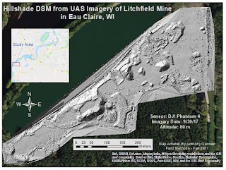
Figure 8: This map shows the same DSM map, only with a hillshade added.  It really shows the terrain better in regards to slope and texture of the surface.  


Figure 9: This map shows the orthomosaic that was a result of the processing in PIX4D.  It actually looked quite similar to the imagery basemap from ESRI.  The surface looks quite realistic from this scale, so it seems the drone did capture some valuable images after all.  The resolution does have its limit however, because when zooming in and examining in the 3D Ray Cloud viewer some of the objects on the surface are slightly distorted.  Things like cars and people are not perfect, but it does a very good job at reconstructing the surfaces to a decent enough degree that can model the things intended for the project.  

Conclusion
Overall this was a good introduction to the current premier photogrammetry processing software for UAS data.  It showed that remote sensing can be quite valuable for acquiring highly detailed imagery and producing a 2D or 3D model from the data.  When working with this data in the next project and actually using GCPs it will be enlightening to see how these models are not actually as accurate as one might think by just glancing at it. 


Monday, December 4, 2017

Sandbox Visualization

Introduction
The purpose of this lab was to follow up with the sandbox activity done earlier in the semester.  A digital surface was to be created of the sandbox terrain pictured and measured in the first part of the activity.

In the previous section, the sandbox terrain contained in roughly a square meter was shaped then measured on a grid of points from a "sea level", or a flat surface height from which all points were measured from above.  Because the points were all measured below the sea level, each point has a negative value.  The points with x, y, and z coordinates were recorded and put into an excel spreadsheet, mocking location in the sandbox.  The actual terrain of the sandbox is shown in Figure 1.
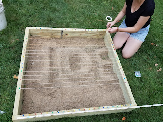
Figure 1: This picture shows the sandbox with the shape of the terrain and the sea level being set above the surface.  


Key Term:
Data Normalization: the process of organizing rows and columns of a database in a way that supports how that data will be used/displayed.
-In the case of this activity, the data had to be normalized from the previous formatting into a way that could be brought into ArcMap and easily understood and mapped.

Interpolation: a tool can be used to predict values in between points or cells in a raster.  It is used for continuous surfaces containing values for things like elevation, rainfall, temperature, etc.
-Five interpolation methods were used in this activity.
  • IDW 
  • Kriging 
  • Natural Neighbor 
  • Spline 
  • TIN 
Each uses different equations/methods that result in a predicted surface, but only one was chosen as the one that best represented the actual sandbox terrain surface.


Methods
The first step was to create a personal folder for this project within the class folder, as well as a geodatabase for all the results produced throughout the project.  Figure 2 shows the geodatabase in ArcMap.
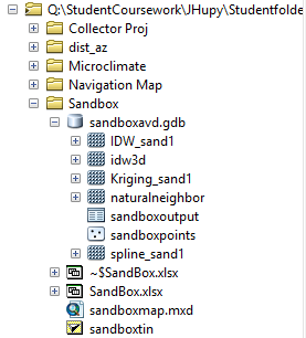
Figure 2: A screenshot of the geodatabase created for this project.  


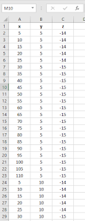
Next the data in the original excel file had to be normalized from the mock map of the terrain into three columns: x, y, and z.  This was done so that ArcMap could easily recognize how the sheet and map it accordingly.
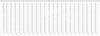
Figure 3: This screenshot shows how the data was originally organized in Excel.  

Figure 4: This screenshot shows the data after being normalized for this project into x, y, and z values.  

"Add XY Data" was used to bring points into ArcMap.  Once this was done it was converted into a point feature class.  When this was done a coordinate system was asked to be assigned, but this was not necessary because the survey was of such a small area and of such accuracy that it was not significant enough for a coordinate system to be important.


Next a continuous surface was created for each of the five interpolation methods.  The explanations, pros and cons of each of these techniques is listed below.  (information from ArcGIS.com)


IDW (Inverse Distance Weight) - determines cell values using a linearly weighted combination of a set of sample points. The weight is a function of inverse distance. The surface being interpolated should be that of a locationally dependent variable.
pros: -when samples are densely located the surface will be very accurate
cons: -it can not show the highest peaks or lowest valleys if those values are not already sampled.

Kriging - a geostatistical model based on autocorrelation, the statistical relationships among the measured points.
pros: -has the ability to estimate the level of certainty or accuracy of the predicted surface.
cons: -extensive and often not necessary if there is no spatially correlated distance or directional bias in the data.

Natural Neighbor - finds the closest subset of input samples to a query point and applies weights to them based on proportionate areas to interpolate a value (Sibson 1981).
pros: -simplest method and creates smooth surface.
cons: -only uses the closest points to estimate surface.  It does not infer peaks, low points, or trends.

Spline - estimates values using a mathematical function that minimizes overall surface curvature.
pros: -results in a smooth surface that passes exactly through the input points and good for gently sloping surfaces.
cons: -does not accurately represent surfaces that are naturally sharp, steep, or have a lot of variance in close proximity.

TIN - TINs are a form of vector-based digital geographic data and are constructed by triangulating a set of vertices (points).  The input features used to create a TIN remain in the same position as the nodes or edges in the TIN.
pros: -allows preservation of data points while modeling the values between points.  This model also takes very little storage space.
cons: -not a smooth surface, very sharp jagged.

Each tool was searched using the search bar and the spatial analyst of each tool was chosen to run the method, as shown in Figure 5.
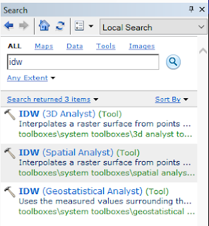
Figure 5: The Search bar was used to find each of the interpolation tools, and the spatial analyst tool was chosen to run each process.  


Each of the surfaces created from the five methods were then brought into ArcScene to be displayed in 3D.  They were then exported back into ArcMap to be displayed next to the 2D surfaces.  Maps were created to show both the 2D and 3D surface models of the sandbox terrain.

Results
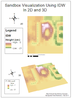

Figure 6: This map shows the resulting IDW map.  The result obviously displays exactly where many of the data points are located.  Each of those indentations or bumps makes the surface look unrealistic.  

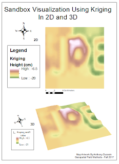
Figure 7: This is the resulting surfaces map from the kriging tool.  It has a nice smooth surface, but it seems a bit too generalized when compared to the real sandbox terrain and the rest of the surfaces from other tools.  

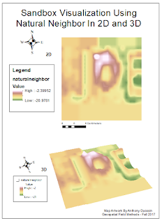
Figure 8: This is the resulting map from the natural neighbor tool.  It actually does a very good job at estimating the surface.  It is smooth yet it does not over-generalize the details of the terrain like the slopes, high points and low points.  

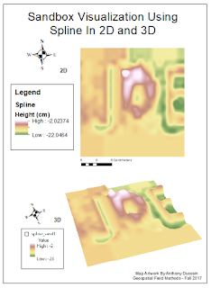
Figure 9: This is the resulting map from the spline tool.  This tool did a great job and arguably best represents the actual terrain of the sandbox.  It does a good job of making the surface smooth, yet does not over-generalize the actual points just to make that surface smooth.  It seems just a little more realistic than the natural neighbor surface.  

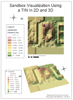
Figure 10: This is the resulting map from the creation of the TIN.  It is observably blocky but it still produces a decent shape of the real terrain.  It shows where there may be the steepest slopes as well as high points and low points.  


Conclusion
This activity served as just a smaller version of a real survey done on a larger scale of real world surfaces/features.  There was a grid of recorded points with x, y, and z coordinates that were used to create a 3D model.  That model could be used to measure volumes and distances, create paths, or study observable patterns.  Grid based models like this however may not always be the answer because differences in various landscapes will demand specific concentrations of recorded points with x, y, and z values.

Interpolation methods can be used for things other than elevation.  It is commonly used for creating temperature, wind, and other weather maps.  It can be used for basically any sort of location based recorded data that needs gaps filled in between points to make a continuous (and sometimes smooth) estimated surface.


References
-ArcGISOnline.com
-Professor Joseph Hupy